Log in
Sign up
Log out
Profile
Clone Style Guide
Log in
Sign up
First
Last
email@email.com
Update Image
My Profile
Billing
Logout
More Filters
Component interaction
Featured
Checkbox 8
Accordion
0
[
0
]
Card
0
[
0
]
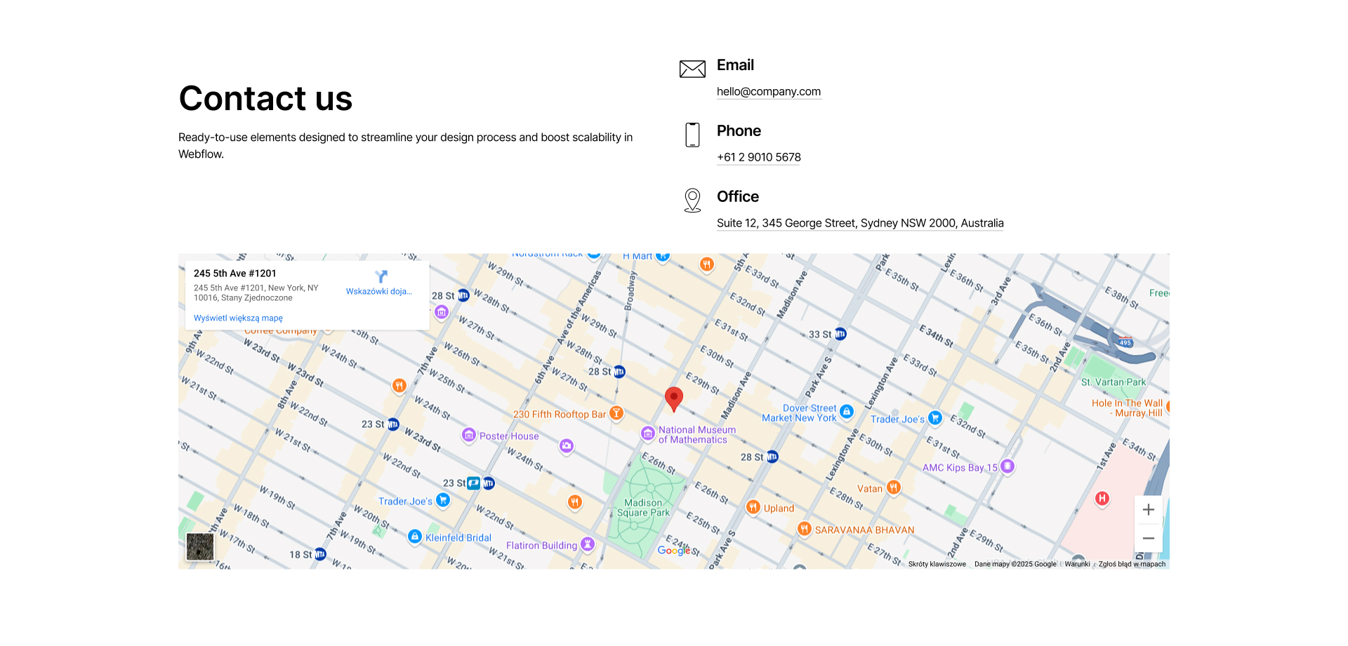
Contact
0
[
0
]
Cta
0
[
0
]
Event
0
[
0
]
FAQ
0
[
0
]
Features
0
[
0
]
Footer
0
[
0
]
Header
0
[
0
]
Hero
0
[
0
]
List
0
[
0
]
Logo
0
[
0
]
Nav
0
[
0
]
Pricing
0
[
0
]
Step
0
[
0
]
Tabs
0
[
0
]
Team
0
[
0
]
Testimonial
0
[
0
]
Title
0
[
0
]
Clear All
Thank you! Your submission has been received!
Oops! Something went wrong while submitting the form.
Results
1
Showing items
1
to
3
of
6
Filtering by:
Tag
Operator
Value
Cta 28
interaction
COPY TO WEBFLOW
PREVIEW
Cta
Contact 28
interaction
COPY TO WEBFLOW
PREVIEW
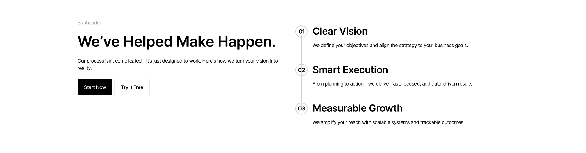
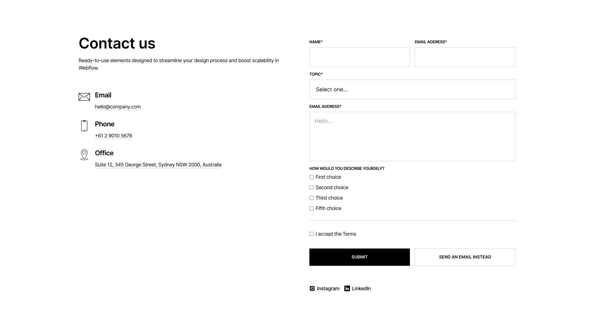
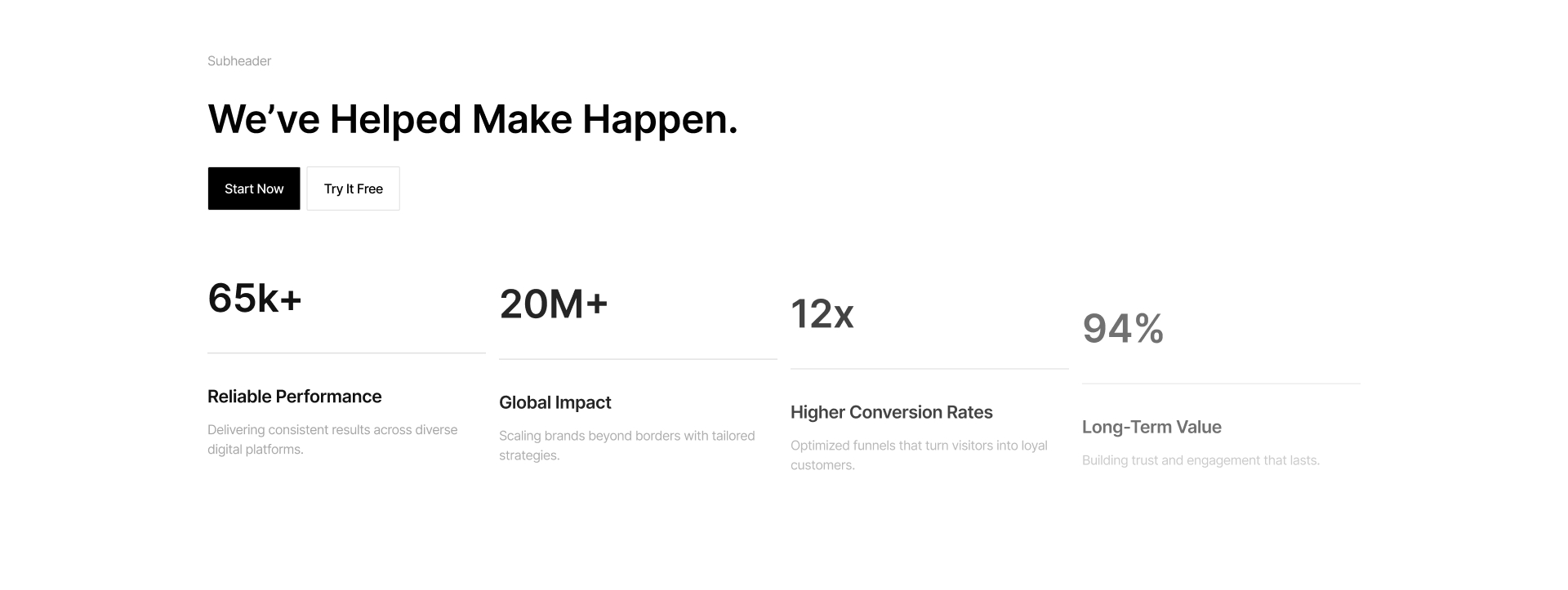
Contact
Features 28
interaction
COPY TO WEBFLOW
PREVIEW
Features
Card 27
interaction
COPY TO WEBFLOW
PREVIEW
Card
Cta 27
interaction
COPY TO WEBFLOW
PREVIEW
Cta
Contact 27
interaction
COPY TO WEBFLOW
PREVIEW
Contact
Features 27
interaction
COPY TO WEBFLOW
PREVIEW
Features
Card 26
interaction
COPY TO WEBFLOW
PREVIEW
Card
Cta 26
interaction
COPY TO WEBFLOW
PREVIEW
Cta
Component interaction
Contact 26
interaction
COPY TO WEBFLOW
PREVIEW
Contact
Features 26
interaction
COPY TO WEBFLOW
PREVIEW
Features
Card 25
interaction
COPY TO WEBFLOW
PREVIEW
Card
Cta 25
interaction
COPY TO WEBFLOW
PREVIEW
Cta
Component interaction
Contact 25
interaction
COPY TO WEBFLOW
PREVIEW
Contact
Features 25
interaction
COPY TO WEBFLOW
PREVIEW
Features
Card 24
interaction
COPY TO WEBFLOW
PREVIEW
Card
Cta 24
interaction
COPY TO WEBFLOW
PREVIEW
Cta
Contact 24
interaction
COPY TO WEBFLOW
PREVIEW
Contact
Features 24
interaction
COPY TO WEBFLOW
PREVIEW
Features
Card 23
interaction
COPY TO WEBFLOW
PREVIEW
Card
Cta 23
interaction
COPY TO WEBFLOW
PREVIEW
Cta
Contact 23
interaction
COPY TO WEBFLOW
PREVIEW
Contact
Features 23
interaction
COPY TO WEBFLOW
PREVIEW
Features
Card 22
interaction
COPY TO WEBFLOW
PREVIEW
Card
Cta 22
interaction
COPY TO WEBFLOW
PREVIEW
Cta
Contact 22
interaction
COPY TO WEBFLOW
PREVIEW
Contact
Features 22
interaction
COPY TO WEBFLOW
PREVIEW
Features
Header 22
interaction
COPY TO WEBFLOW
PREVIEW
Header
Card 21
interaction
COPY TO WEBFLOW
PREVIEW
Card
Cta 21
interaction
COPY TO WEBFLOW
PREVIEW
Cta
Component interaction
Contact 21
interaction
COPY TO WEBFLOW
PREVIEW
Contact
Features 21
interaction
COPY TO WEBFLOW
PREVIEW
Features
Previous
1
...
Next
There are no available cars matching the current filters.
Reset All


