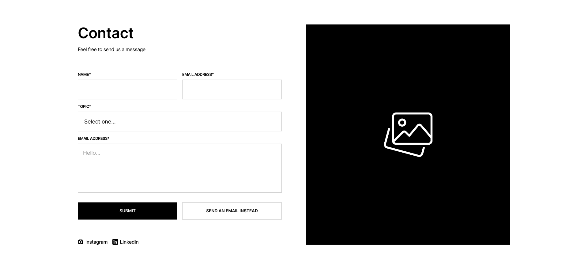
Contact
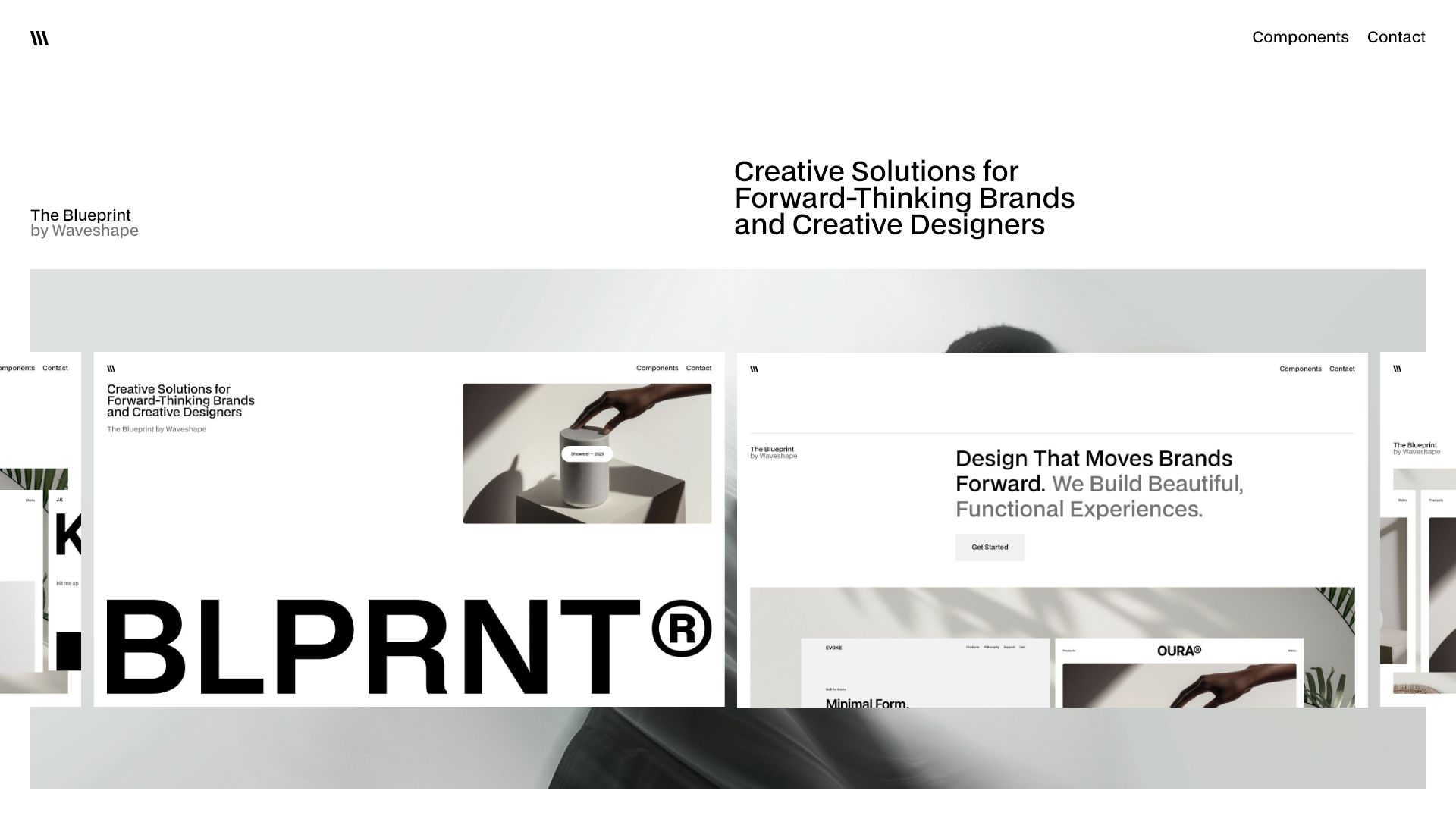
Free Webflow components – ready to use
Speed up your work on websites with a free library of sections and elements. Everything is available without restrictions, always free of charge.
Showreel — 2025
Showreel — 2025
4 min
More Filters
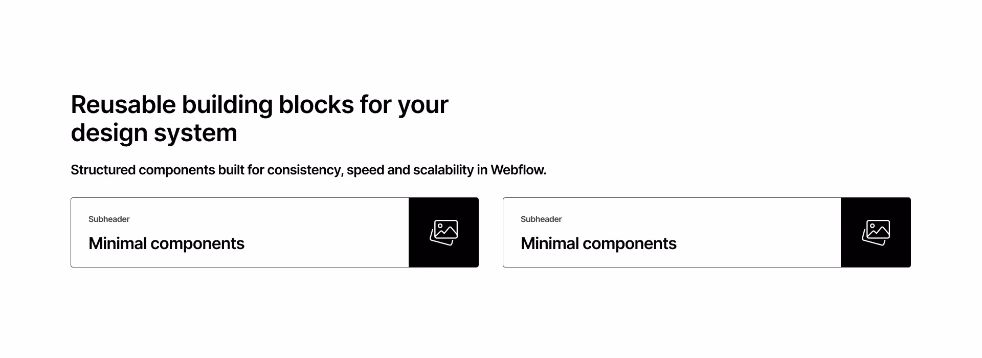
Component interaction
Featured
Checkbox 8
Accordion
0
[
0
]
Card
0
[
0
]
Contact
0
[
0
]
Cta
0
[
0
]
Event
0
[
0
]
FAQ
0
[
0
]
Features
0
[
0
]
Footer
0
[
0
]
Header
0
[
0
]
Hero
0
[
0
]
List
0
[
0
]
Logo
0
[
0
]
Nav
0
[
0
]
Pricing
0
[
0
]
Step
0
[
0
]
Tabs
0
[
0
]
Team
0
[
0
]
Testimonial
0
[
0
]
Title
0
[
0
]
Clear All
Thank you! Your submission has been received!
Oops! Something went wrong while submitting the form.
Results
1
Showing items
1
to
3
of
6
Filtering by:
Tag
Operator
Value
Footer 8
interaction
COPY TO WEBFLOW
PREVIEW
Footer
Header 8
interaction
COPY TO WEBFLOW
PREVIEW
Header
Testimonial 8
interaction
COPY TO WEBFLOW
PREVIEW
Testimonial
Logo 8
interaction
COPY TO WEBFLOW
PREVIEW
Logo
Nav 8
interaction
COPY TO WEBFLOW
PREVIEW
Nav
Team 8
interaction
COPY TO WEBFLOW
PREVIEW
Team
Title 8
interaction
COPY TO WEBFLOW
PREVIEW
Title
Card 8
interaction
COPY TO WEBFLOW
PREVIEW
Card
Hero 8
interaction
COPY TO WEBFLOW
PREVIEW
Hero
Features 8
interaction
COPY TO WEBFLOW
PREVIEW
Features
Cta 7
interaction
COPY TO WEBFLOW
PREVIEW
Cta
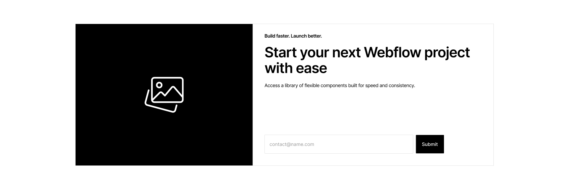
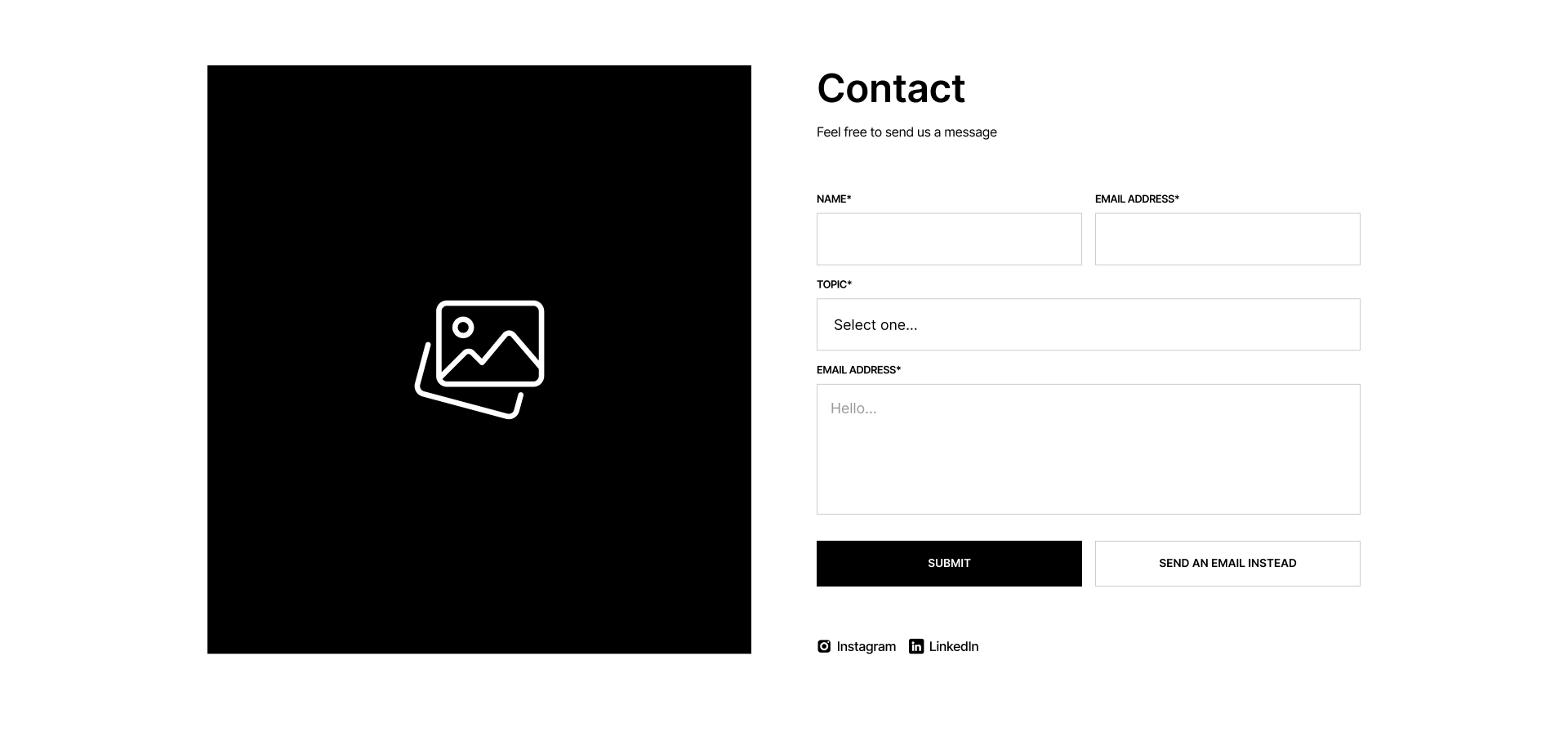
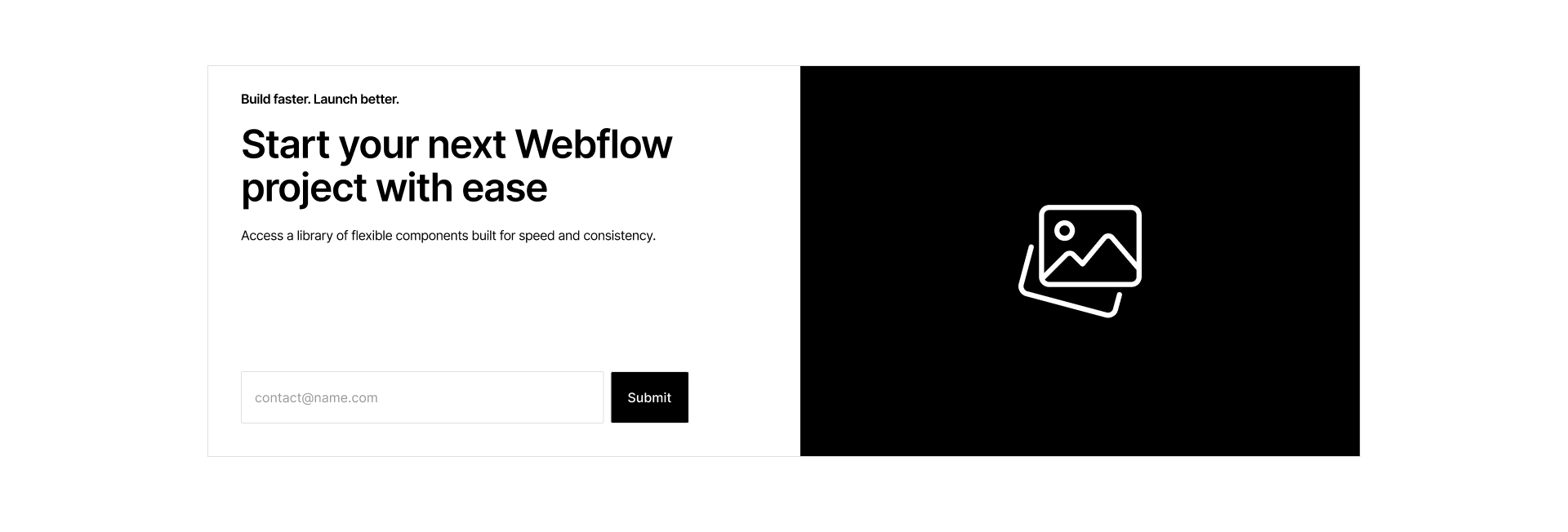
Contact 7
interaction
COPY TO WEBFLOW
PREVIEW
Contact
Footer 7
interaction
COPY TO WEBFLOW
PREVIEW
Footer
Header 7
interaction
COPY TO WEBFLOW
PREVIEW
Header
Testimonial 7
interaction
COPY TO WEBFLOW
PREVIEW
Testimonial
Logo 7
interaction
COPY TO WEBFLOW
PREVIEW
Logo
Nav 7
interaction
COPY TO WEBFLOW
PREVIEW
Nav
Team 7
interaction
COPY TO WEBFLOW
PREVIEW
Team
List 7
interaction
COPY TO WEBFLOW
PREVIEW
List
Title 7
interaction
COPY TO WEBFLOW
PREVIEW
Title
Card 7
interaction
COPY TO WEBFLOW
PREVIEW
Card
Hero 7
interaction
COPY TO WEBFLOW
PREVIEW
Hero
Features 7
interaction
COPY TO WEBFLOW
PREVIEW
Features
Cta 6
interaction
COPY TO WEBFLOW
PREVIEW
Cta
Contact 6
interaction
COPY TO WEBFLOW
PREVIEW
Contact
Footer 6
interaction
COPY TO WEBFLOW
PREVIEW
Footer
Header 6
interaction
COPY TO WEBFLOW
PREVIEW
Header
Step 6
interaction
COPY TO WEBFLOW
PREVIEW
Step
Testimonial 6
interaction
COPY TO WEBFLOW
PREVIEW
Testimonial
Logo 6
interaction
COPY TO WEBFLOW
PREVIEW
Logo
Nav 6
interaction
COPY TO WEBFLOW
PREVIEW
Nav
Team 6
interaction
COPY TO WEBFLOW
PREVIEW
Team
Previous
1
...
Next
There are no available cars matching the current filters.
Reset All

