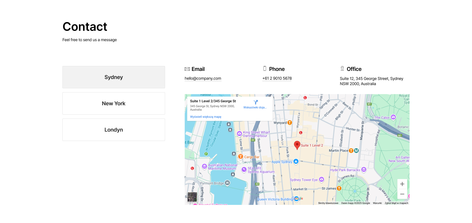
Free Webflow components – ready to use

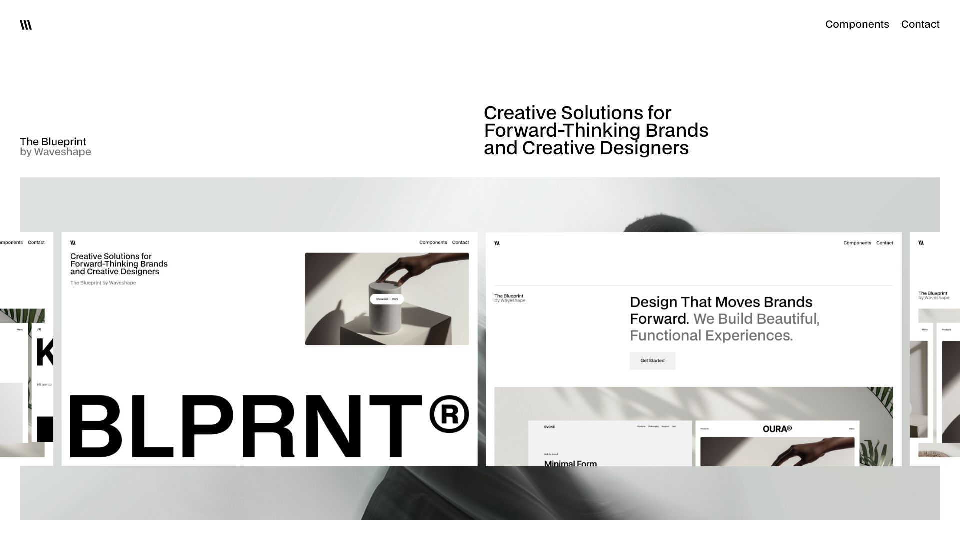
Speed up your work on websites with a free library of sections and elements. Everything is available without restrictions, always free of charge.
Showreel — 2025
Showreel — 2025
Play
4 min
Movement
Featured
Clear All
Thank you! Your submission has been received!
Oops! Something went wrong while submitting the form.

Results 1

Showing items 1 to3 of 6

Filtering by:
Tag
Operator
Value
Features 16
interaction
Webflow features component with bold headline “Kickstart Your Next Webflow Project” and three columns below: Modern, Standard, and Features – each with an icon, title, and short text description. Clean and responsive layout.
Features
Footer 16
interaction
Webflow component footer with logo, address, contact info, two navigation columns, email subscription form, and social icons.
Footer
Header 16
interaction
Header 16 Webflow component with bold central headline, subheader about UI blocks, and two call-to-action buttons: Start Now and Try It Free
Header
Nav 16
interaction
Webflow blog layout component with article list in columns and thumbnail previews with titles, text, and Read more links
Nav
Card 16
interaction
Responsive Webflow component showcasing horizontal team member cards with images, names, job titles, descriptions, and LinkedIn links
Card
Cta 15
interaction
Webflow CTA component with headline, subtext, dual buttons and brand icon row
Cta
Component interaction
Contact 15
interaction
Two-column contact component showing office locations for Sydney and New York, each with address, city name, and “Get Directions” link below a placeholder image
Contact
Footer 15
interaction
Advanced Webflow footer component with six-column layout, bold headline, email subscription form, and social media icons
Footer
Header 15
interaction
Header 15 Webflow component with dark background, large white headline on the left, and paragraph text on the right describing layout flexibility and user experience
Header
Nav 15
interaction
Webflow dropdown mega menu with eight service items in two columns, including Webflow development, branding, UX audits, and landing pages
Nav
Card 15
interaction
Responsive Webflow grid layout displaying eight team member cards with profile images, roles, descriptions, and LinkedIn link
Card
Features 15
interaction
Feature section with a white card on black background showing travel service benefits like expert guidance, logistics, flexible scheduling, and local experiences, with a large image icon in the background.
Features
Cta 14
interaction
Webflow CTA component with headline, supporting text, dual buttons, and large visual placeholder
Cta
Contact 14
interaction
Webflow component displaying Sydney contact details with a vertical location selector on the left, email and phone information in the center, office address to the right, and an embedded Google Map showing the office location at Suite 12, 345 George Street, Sydney
Contact
Component interaction
Footer 14
interaction
Modern Webflow footer component with five-column link layout, company logo, headline text, email subscription form, and social media icon
Footer
Header 14
interaction
Header 14 Webflow component with dark background, bold left-aligned headline, overlaid image icon, and descriptive text on the right.
Header
Nav 14
interaction
Webflow navigation component with dropdown menu listing four services including Webflow development and UX/UI optimization
Nav
Card 14
interaction
Webflow team section component with six horizontal profile cards featuring photo placeholders, name, job title, description, and LinkedIn icons
Card
Features 14
interaction
Feature section with two black cards; the left card shows a bright green circular "MORE" button with hover effect, and the right card displays a white image icon
Features
Cta 13
interaction
CTA Webflow component with headline, description, buttons, and dark image placeholder
Cta
Contact 13
interaction
Webflow component featuring contact details for Sydney with a clean horizontal layout: location selector on the left, email, phone, and office address centered, and a large black image placeholder on the right.
Contact
Component interaction
Footer 13
interaction
Large Webflow footer component with three-column layout, navigation links, company logo, description text, and social media icons
Footer
Header 13
interaction
Header 13 Webflow component with dark background, bold headline, subheader, description text, and two CTA buttons
Header
Nav 13
interaction
Webflow sidebar navigation component with vertical link list and dropdown support
Nav
Card 13
interaction
Call to action section with headline, subheading, and dual buttons for Get Started and Sign Up – Webflow component
Card
Features 13
interaction
Intro section promoting free Webflow components with bold headline, subheading, call-to-action buttons, and image previews
Features
Cta 12
interaction
Minimal Webflow component with headline, email input and submit button for design system sign-up.
Cta
Contact 12
interaction
Minimal black and white Webflow component with location buttons (Sydney, New York, London) and contact details including email, phone, and office address; right side shows a black box with an image icon placeholder.
Contact
Component interaction
Footer 12
interaction
Modern Webflow footer component with top navigation, email subscription form, large logo area, and legal links
Footer
Header 12
interaction
Header 12 Webflow component with large headline, subtext, image and dual CTA buttons on dark background.
Header
Nav 12
interaction
Webflow component – minimal navigation bar with logo, menu links (Home, Work, Service, About), and a prominent ‘Contact’ button.
Nav
Features 12
interaction
Team section Webflow component displaying team member photos, names, and roles in a grid layout.
Features
There are no available cars matching the current filters.
Reset All